5 Critical Website Audit Questions To Ask Yourself
Do I write how I would normally talk?
It’s important to speak in your own voice on your website, rather than using formal or overly technical language. People connect best with content that feels authentic and relatable, rather than overly corporate or dry. This way people will feel like they’re interacting with a real person, rather than a company that’s trying to sell something.
Here’s an example of a website that uses big words and makes the process feel scary:
From there, we gather data. Some of this is factual and objective: date of birth, investments, insurance policies. Some of this ephemeral and subject: what do you envision for your retirement years? What do you want for your family if something should happen to you? Your planner will take this information and assess all of it, looking for gaps and deficiencies, areas that can be improved, and if you’re on track toward your dreams. Next, we’ll develop a plan to help you address the weak areas, and get you on track towards your goals. This step involves two to three meetings as we refine ideas, methods, and objectives.
How could this feel better for the reader?
At the start of our process, we prioritize getting to know all we can about you and where you are on life's journey. We'll ask questions like "What led you to reach out to us?" and "What are the things you care most about in life?" We also strive to learn about your thoughts and feelings toward money, and about the values that drive your decisions. These insights guide our work together, allowing us to tailor our advice. We'll do some additional intake to confirm your core values and beliefs, understand your feelings on risk and return, and see what you're looking forward to. We'll capture the important people, places, and things in your life. We'll take a thorough financial inventory of everything you own, what you owe, and your current and future income. Then we use all this information to start answering your key questions and plotting out a plan of action with your unique needs and goals in mind. As a team, we'll work through your financial data, and in combination with all our meeting notes, start to assess what's going well, what is not, what are your goals, and how can we help you get there.
Do I have the right pages for my business needs?
It’s important to make sure that your website has all the pages that are relevant to your business, and that each page serves a clear purpose.
For example, if your business offers a specific type of service, it should have a dedicated page explaining that service in detail. The same goes for a portfolio page, which should showcase your business’ best work. As for your blog, this is a great way to provide helpful and informative content that will engage visitors and establish your business as an authority in your industry and keep them informed.
Every business is different, but here’s a list of the some of the web pages you may want to include:
Home
Services
Portfolio
About
Contact
Blog
Resources
Podcast
And more…
Is my photography on-brand?
Consistent branding is key, and that includes images and visuals. Having images that are on-brand can make a huge difference in how visitors perceive your business. Using stock images is a great way to get started, especially if you’re on a budget. Grab some free stock images from Pexels or Unsplash. This way your website will feel cohesive and professional.
Look for photos that have the same tone and feel of your website. If your website is bright and cheerful, pictures shouldn’t be dark and moody. You should use photos that are relevant to your location. For example, you wouldn’t want to use images of mountains if you live near the beach. If you have an ideal or target client in mind, use images of people that match their demographic.
Does my About Page authentically reflect me and my brand?
Your website's About Page is often the most popular, so it's important to make it count. Use this space to tell your story, communicate your values, and highlight what sets you apart. Adding pictures of your team and sharing behind-the-scenes glimpses can help to create a more personal experience. Providing information about what's next and including client testimonials can also build trust and credibility with your audience. Don't be afraid to inject your own personality into the page – this will make it more memorable and help create a meaningful connection with your visitors.
Does my website look dated and unprofessional?
As a general rule, it's recommended to refresh your website design every two years. This ensures that you keep up with the latest web design trends and maintain a modern and professional appearance. An outdated website can deter potential customers and impact your business's credibility. It's important to compare your website to competitors and other businesses in your industry to evaluate its effectiveness. Additionally, be sure to assess your website's load speed, as slow loading times can be a major turn-off for users.
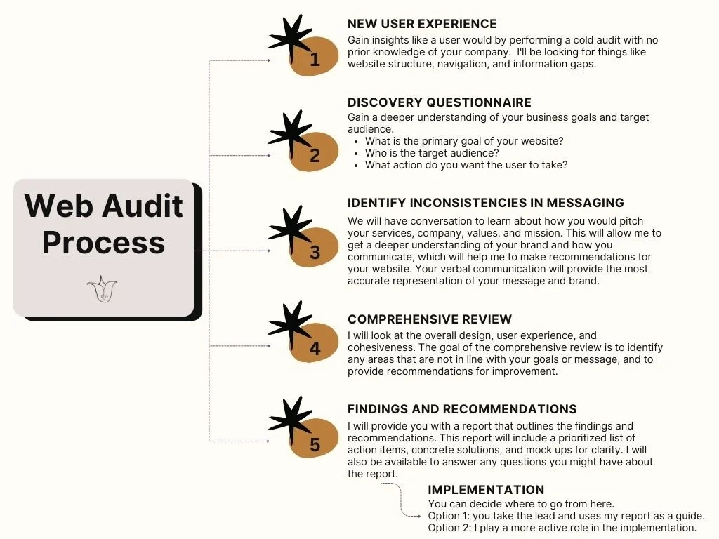
Are you ready to update your website with fresh and modern copy and design? Reach out to schedule a free consultation today! I’m excited to help you create a website that's both professional and impactful, while still reflecting your unique style and personality.

